Horizon
Horizon’s new media kit was built to communicate the company’s bold vision through an elegant, editorial-inspired layout. We curated a flexible design system that works across print and digital, incorporating striking typography, clean grids, and a color palette that reflects the brand’s forward-thinking spirit.
Brand Identity
Jakarta, Indonesia
Overview
Horizon approached us to create a comprehensive media kit that could clearly communicate their brand story to press, partners, and investors. While their core values were strong, their brand identity lacked visual cohesion and a clear system for presenting assets.
Challenge
The existing brand materials were fragmented—logos, color schemes, and messaging varied widely depending on who produced them. Without a unified design language, their external communications felt inconsistent and diluted their message.

Outcome
The finalized Horizon Media Kit became a central brand asset, streamlining how the company presented itself in all external communications. Press coverage improved as journalists received a clean, consistent set of materials. Internal teams could now pull ready-to-use, brand-compliant resources without design bottlenecks.
Design System Implementation
We built a scalable brand system including logo variations, a refined color palette, typography hierarchy, photography guidelines, and brand voice principles. All assets were packaged in an easy-to-navigate format, with editable templates for press releases, presentations, and social content.

Tone & Visual Direction
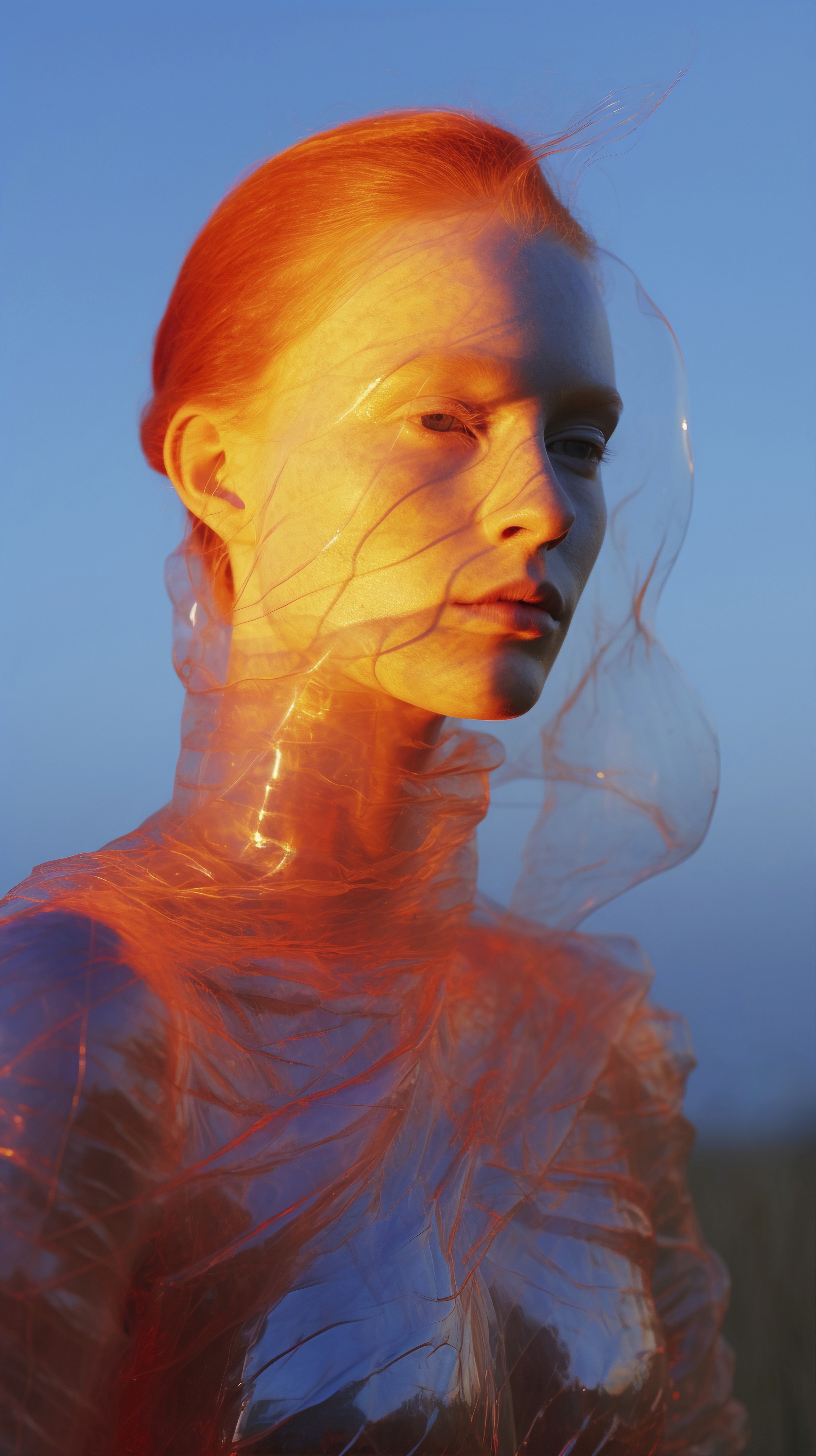
We crafted a visual direction that emphasized clarity, sophistication, and approachability. The palette combined deep neutrals with warm accent tones, creating a sense of authority balanced with friendliness.

" transform="translate(4 4)" width="32px"/></svg>)